SECTIONS
Total Return | Inflation and Dividend-Distribution Trends | Inflation-Adjusted DataAnnual Averages per Decade
Historical prices for the Standard & Poor's 500 stock-market index can be obtained from websites like Yahoo Finance, using the ^GSPC ticker, or Google Finance, with .INX. Yahoo can even graph the series since 1950. Those numbers, and their corresponding graphs, are useful for evaluating the past performance of stock investments, because the S&P500 index is well regarded as a proxy for the large-cap stock market. Nevertheless, to study the real profitability of the market, we need to average and graph not only the price, but the effect of dividend distributions and inflation as well. That is the purpose of this work.
Total Return
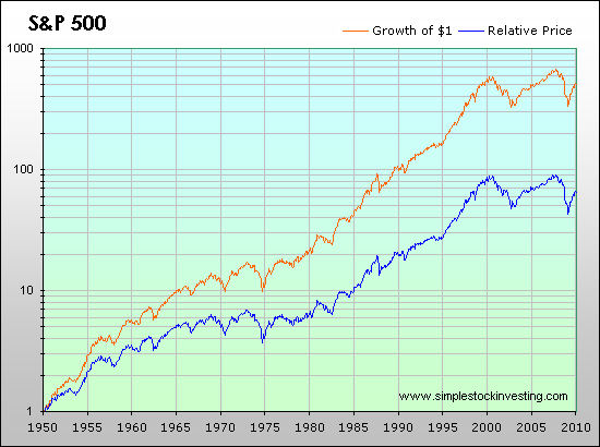
According to Standard & Poor's, the dividend component was responsible for 44 % of the total return of the last 80 years of the index. If we are to analyze the historical profitability of stock investments, this portion cannot be neglected. Therefore, it is of interest to graph and average the total return (meaning the increase in value if all dividends were reinvested) instead of the evolution of price. The following graph shows the S&P 500 historical return since 1950:

The effect of investing $1 in 1950 is seen. The orange curve shows the result of having all dividends reinvested (i.e., the total return), while the blue curve disregards dividends, therefore reflecting only the evolution of price. As can be seen, reinvesting all dividends produced about 8 times the return. Note that the y-axis is logarithmically scaled, for better appreciation of the earlier trends.
Inflation and Dividend-Distribution Trends
Phrases like "one dollar invested in 1926 would be $3000 today" are often heard regardless of the fact that a 1926 dollar has little relation with a 2009 dollar. To evaluate properly how much can be earned through stock investments in a long period of time, the effect of inflation has to be extracted from the picture, by adjusting the intermediate results according to an index such as the Consumer Price Index published by the U.S. Department of Labor.
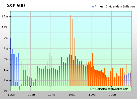
The following graph shows inflation per year, together with annual dividend distribution rates. Some interesting trends can be seen in both:

As we observe in the graph, in recent years the stock market delivers more of its profits through capital gains. You can also see the high inflation rates that occured in the 1970s.
Inflation-Adjusted Data
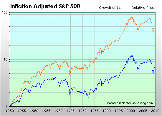
Incorporating inflation data to historical total returns and relative prices produces the following inflation-adjusted graph:

As can be seen, the stock market was very profitable, in real terms, in the 1950 to 1965 and 1983 to 2000 periods. On the other hand, it didn't perform well from 1965 to 1983, and neither it did for the last decade. Still, during these periods, it partially worked as a shelter from inflation.
Annual Averages per Decade
The following table shows average annual results for each decade:
| Price Change |
Dividend Dist. Rate |
Total Return |
Inflation | Real Price Change |
Real Total Return |
|
|---|---|---|---|---|---|---|
| 1950's | 13.2 % | 5.4 % | 19.3 % | 2.2 % | 10.7 % | 16.7 % |
| 1960's | 4.4 % | 3.3 % | 7.8 % | 2.5 % | 1.8 % | 5.2 % |
| 1970's | 1.6 % | 4.3 % | 5.8 % | 7.4 % | -5.4 % | -1.4 % |
| 1980's | 12.6 % | 4.6 % | 17.3 % | 5.1 % | 7.1 % | 11.6 % |
| 1990's | 15.3 % | 2.7 % | 18.1 % | 2.9 % | 12.0 % | 14.7 % |
| 2000's | -2.7 % | 1.8 % | -1.0 % | 2.5 % | -5.1 % | -3.4 % |
| 1950-2009 | 7.2 % | 3.6 % | 11.0 % | 3.8 % | 3.3 % | 7.0 % |
Notes: Figures for dividend distribution rates in the previous table present high uncertainty, of about ±5 %. Geometric averages were calculated for price changes, total returns and inflation. Raw data for this work was obtained from the following sources:
- Standard & Poor's S&P 500
- U.S. Department of Labor
- Yahoo Finance
- Data collected by Robert Shiller, from Yale University, for his book Irrational Exuberance: Second Edition

 Subscribe

